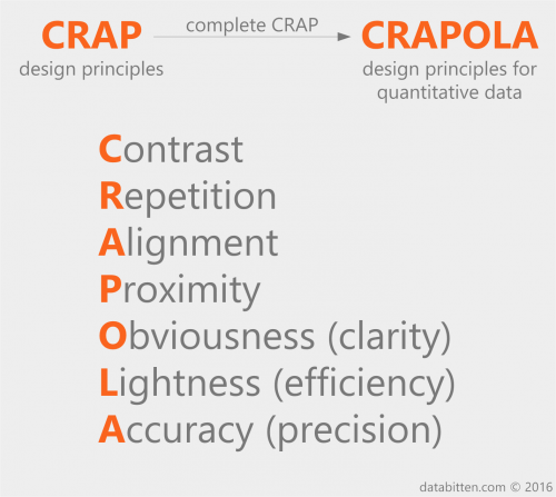
CRAPOLA design principles for quantitative data
Robin Williams (from her website: “writer. teacher. mom. not the actor”) has developed the widely cited CRAP design principles: Contrast, Repetition, Alignment, and Proximity. These are powerful general purpose design principles, but a few additional principles are helpful with respect to the display of quantitative information.
Inspired by the work of Edward Tufte, I propose three additional rules be added to complete CRAP: Obviousness, Lightness, and Accuracy. The resulting CRAPOLA design principles for quantitative data are:
Contrast: avoid similar elements (type, color, size, shape, etc.); if they’re not the same, make them very different.
Repetition: repeat visual elements throughout to organize and unify.
Alignment: every element should have some visual connection with another element.
Proximity: group related items close together to facilitate comparison.
Obviousness (clarity): clearly communicate the data.
Lightness (efficiency): show the data and nothing else.
Accuracy (precision): do not omit or distort data.
comments
Leave a Reply


