The description of surge pricing on Uber’s website begins with the carefully crafted sentence: “Uber rates increase to ensure reliability when demand cannot be met by the number of drivers on the road.” What that really means is that fares are higher at the worst possible time.
If it weren’t for surge pricing, Uber would be America’s most loved corporate darling. Okay, that’s not true at all. What is true is that Uber’s practice of surge pricing is widely disliked. This past New Year’s Eve surge ushered in some particularly bad press (e.g. this and this), so Uber’s on a mission to get back its users’ love.
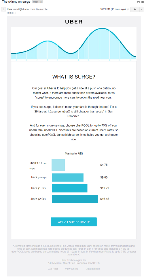
I woke up this morning to an e-mail from Uber justifying and explaining the practice:

Notice anything funny about the graphic toward the bottom of the e-mail? If not, take a moment to look at it again.
See it? There’s a huge mismatch between the prices displayed and the widths of the corresponding bars.
Here are the prices of the illustrative rides and bar widths in Uber’s e-mail (as displayed in Gmail in the latest version of Google Chrome). Also included for each value is percentage change compared to an uberX ride with no surge.

The graphic contains three clear visual lies, each of which skews perception in Uber’s favor:
- The uberX ride with 1.5x surge is 41% more expensive than the uberX ride with no surge, but the corresponding bar is only 13% wider. The effect is that surge pricing is portrayed as less of a jump than it actually is.
- The uberX ride with 2.0x surge is 83% more expensive than the uberX ride with no surge, but the corresponding bar is only 47% wider. The effect is the same.
- The uberPOOL (Uber’s ride-sharing service) ride is 47% less expensive than the uberX ride, but the corresponding bar is 58% narrower. While uberPOOL is significantly cheaper than uberX, the effect portrays uberPOOL as an even better deal than it is. (It is no secret that Uber wantsmore riders to pool.)
I repeat: Uber’s poor visualization makes it look like surge pricing isn’t as much of a jump as it actually is, and that uberPOOL is a better deal than it actually is. That is not good.
Uber’s bar chart doesn’t just use tricks of the eye as many misleading visualizations do. The widths of the bars purporting to represent price simply don’t correspond to the prices in any way. From a data visualization perspective, this is a clear misrepresentation of the facts. Regardless of whether this misrepresentation was intentional or an oversight (to be clear, this article takes no position on this issue), this will almost definitely have an impact on consumer behavior.
Instead of graphing as an afterthought, recognize that visualizations can have real consequences. Which, if you are seeking to spread the truth, is a challenge worth some serious consideration. And which, if you happen to be a propagandist, is pretty darn convenient.
Leave a comment